Overview
Lebara is a mobile network known for affordable international calling, mainly serving migrant workers and expats. In Saudi Arabia, its digital channels no longer matched its offerings. Navigation was complex. Drop-off was high. Self-service was limited. There was no personalization. Everything also had to work equally well in English and Arabic.
The goal was direct: increase revenue and user retention. Getting there meant deciding which features were actually worth building, out of a huge list of possibilities.
I worked on two linked parts of this project. First, the discovery phase. I benchmarked the market and mapped out where the opportunities were. Second, and separately, the illustration and icon system used across the app's empty, loading, and success states.
Nov 2022 - Jun 2023
View on Google Play →Role
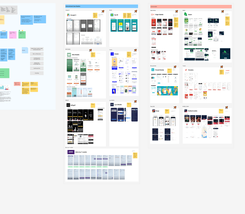
We benchmarked a wide set of telecom apps. This covered local and regional players in Saudi Arabia, plus major international MVNOs like Google Fi, Mint Mobile, Giffgaff, Visible, and My EE. Each one was reviewed screen by screen. We looked at how they handled bundles, recharging, and onboarding.
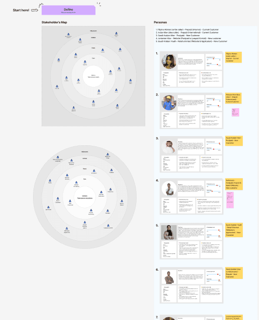
Alongside that, we mapped out Lebara's actual user base as a stakeholder map. It was built around segments like migrant workers on prepaid plans, since that's core to who uses Lebara. That mapping shaped which opportunities were worth prioritizing, and which ones only made sense for a narrow slice of users.

All of this fed into a features discovery document. It split every possible feature into near-term work and a longer-term roadmap. Each feature was mapped to who it served and which channel it belonged on, mobile app or web portal.

Out of everything on the table, two things got greenlit first. The prepaid bundle library, and a Create Your Own Bundle feature. Bundles are the core of how most users top up and use the app day to day. Getting that experience right mattered more than any of the longer-term ideas on the roadmap.
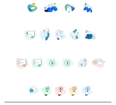
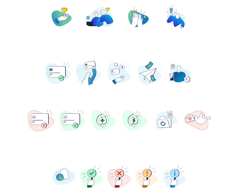
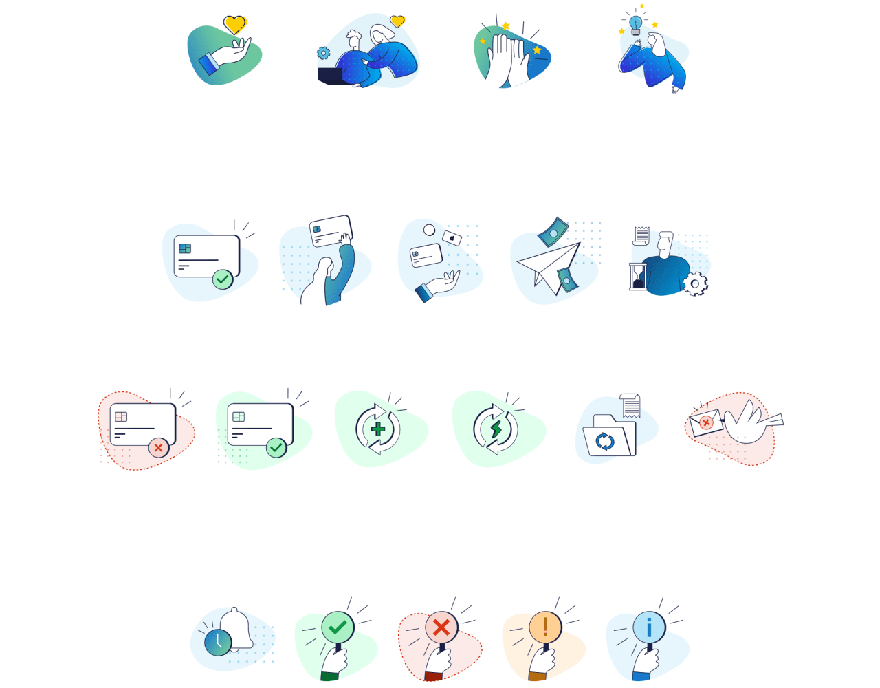
Separately, I designed the illustration and icon system used throughout the app. It covers empty states, loading states, and confirmations. These needed to feel reassuring in moments where the user is just waiting, like a payment processing or a recharge going through.


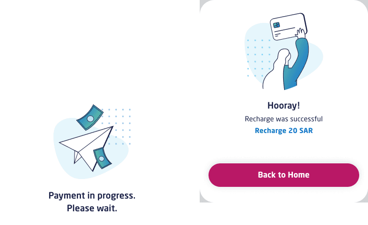
Two of those illustrations at work: a payment loading state, and a successful recharge confirmation.

The app is live today with this work in it. The bundle system, Create Your Own Bundle, and the illustration system all shipped as part of the product. The wider redesign also saw a real increase in engagement.
Let's make something great!